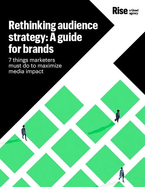
Can you count your marketing partners on one finger?
For fifty-plus years, Quad has been dedicated to creating a better way for its clients, employees and communities, and in the process, has created an extraordinary company run by extraordinary people. Founded in Wisconsin in 1971 as Quad/Graphics, Inc. as a commercial printer, the company became known for excellence in execution and unmatched client service that could be relied upon to deliver in the most challenging of circumstances. In the words of Quad founder Harry Quadracci, the industrial marketing powerhouse “was started with very little money and a lot of trust. People invested in us because they trusted us. People left secure jobs because they trusted us. Suppliers and banks lent us money because they trusted us. They trusted our honesty and integrity.” That trust was immutable throughout Quad’s 50+ year history.
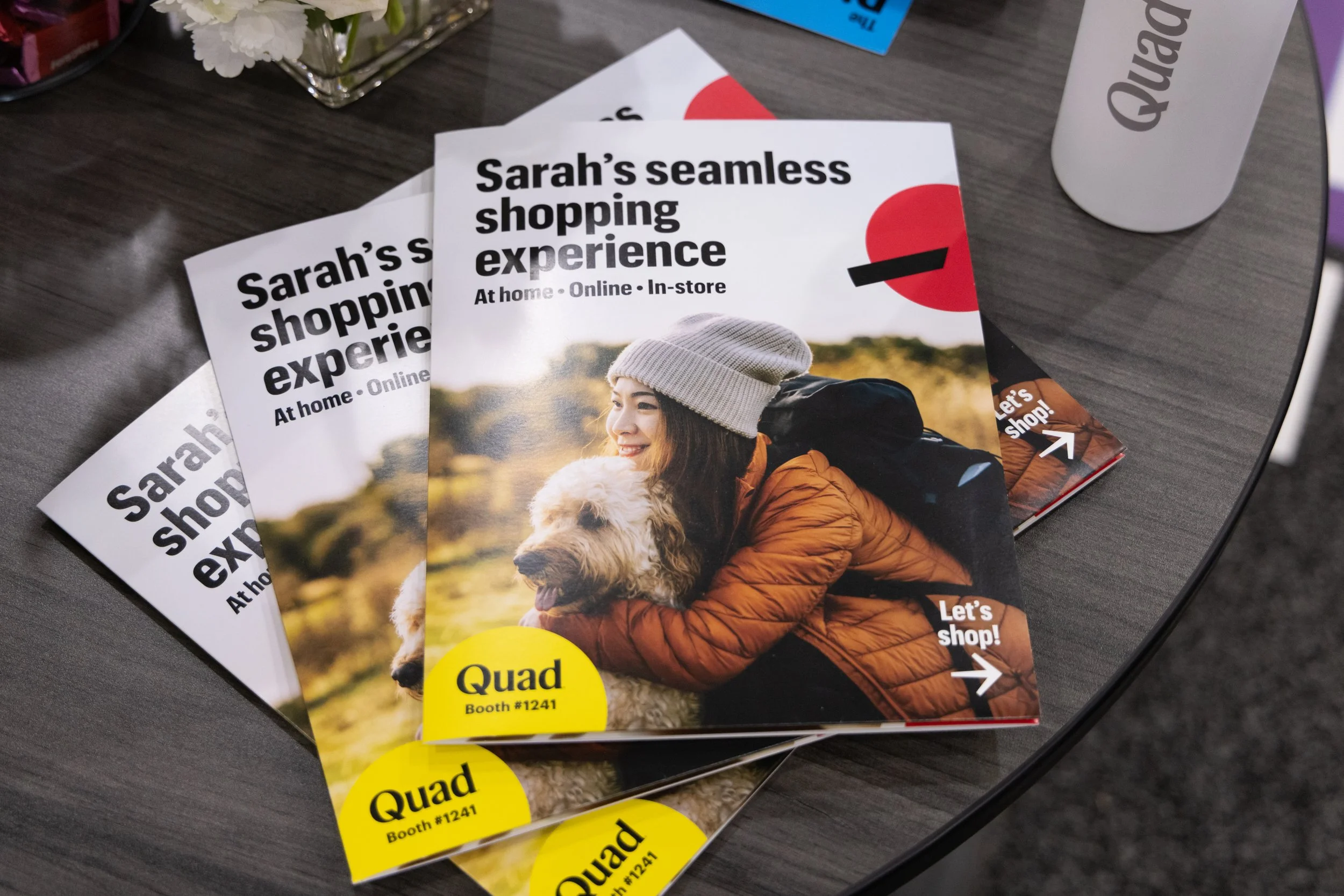
Today, Quad calls itself a Marketing Experience, or MX, company, which means it helps marketers make direct consumer connections. In the intervening years, Quad grew through a combination of blue ocean opportunity and strategic vertical and horizontal acquisitions. From household, to in-store, to online, Quad’s solutions are powered by the speed and scale of its robust production and distribution capabilities that have been optimized over its five-plus decades, as well as a robust data stack built on real people, their homes and their passions.
In 2021, after hiring its first Chief Marketing Officer, the company established its first independent marketing function, charged with helping to bring the brand into strategic alignment with the business. I joined the brand function within that organization in January 2022, and spent the first year leading our brand architecture and design system build-out and implementation. We worked with agency partner Champions Design out of New York and Cupertino as we hired in an in-house design, content and creative function.
At the same time we were designing, implementing and launching our brand identity system, we also partnered with Edelman to develop our first brand campaign platform built on our new business and creative strategy. This work served as the core of our brand voice development and offered a creative framework that allowed Quad to reposition itself to the industry as a truly integrated solution.


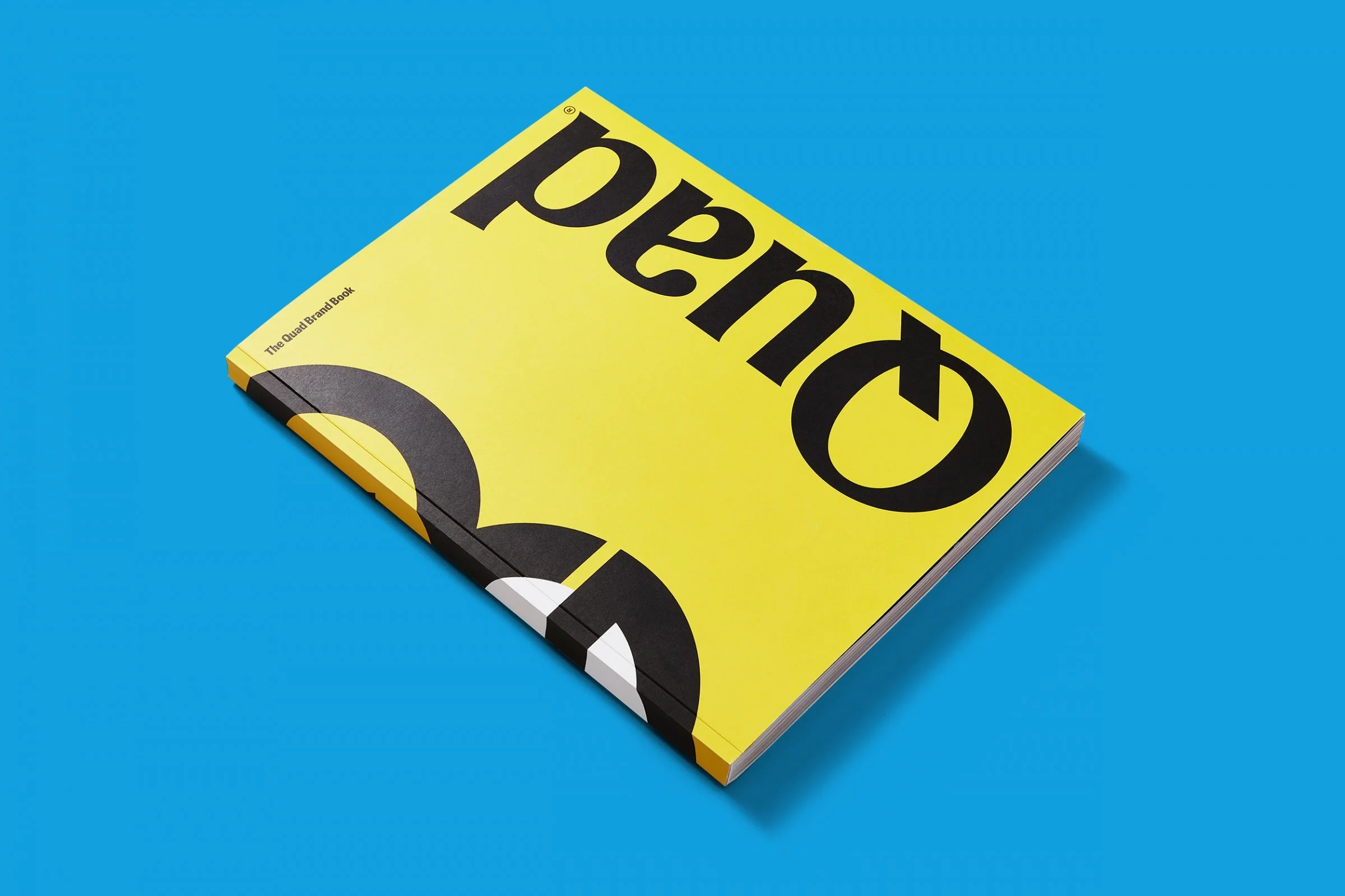


The Way Extraordinary Gets Made
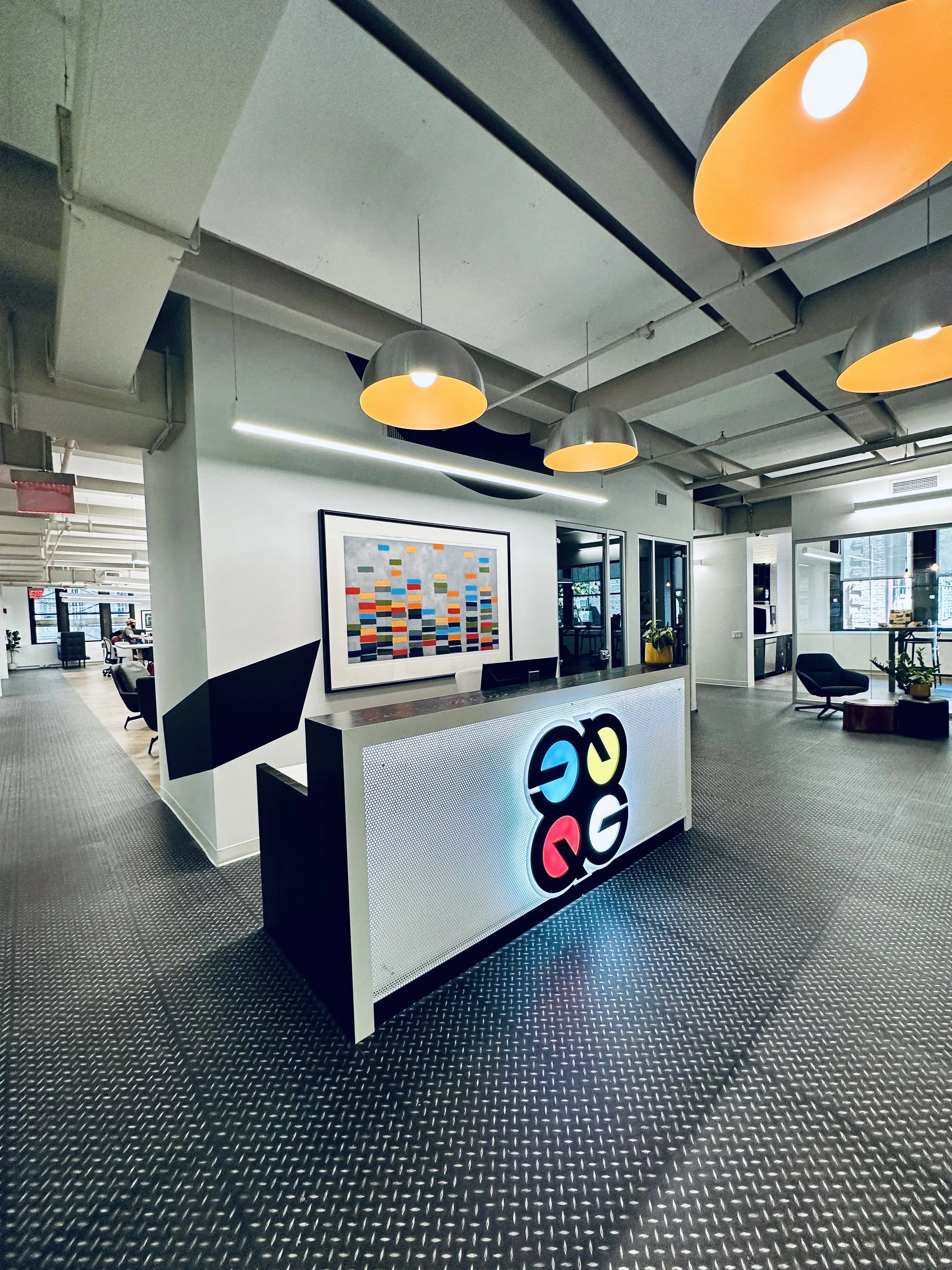
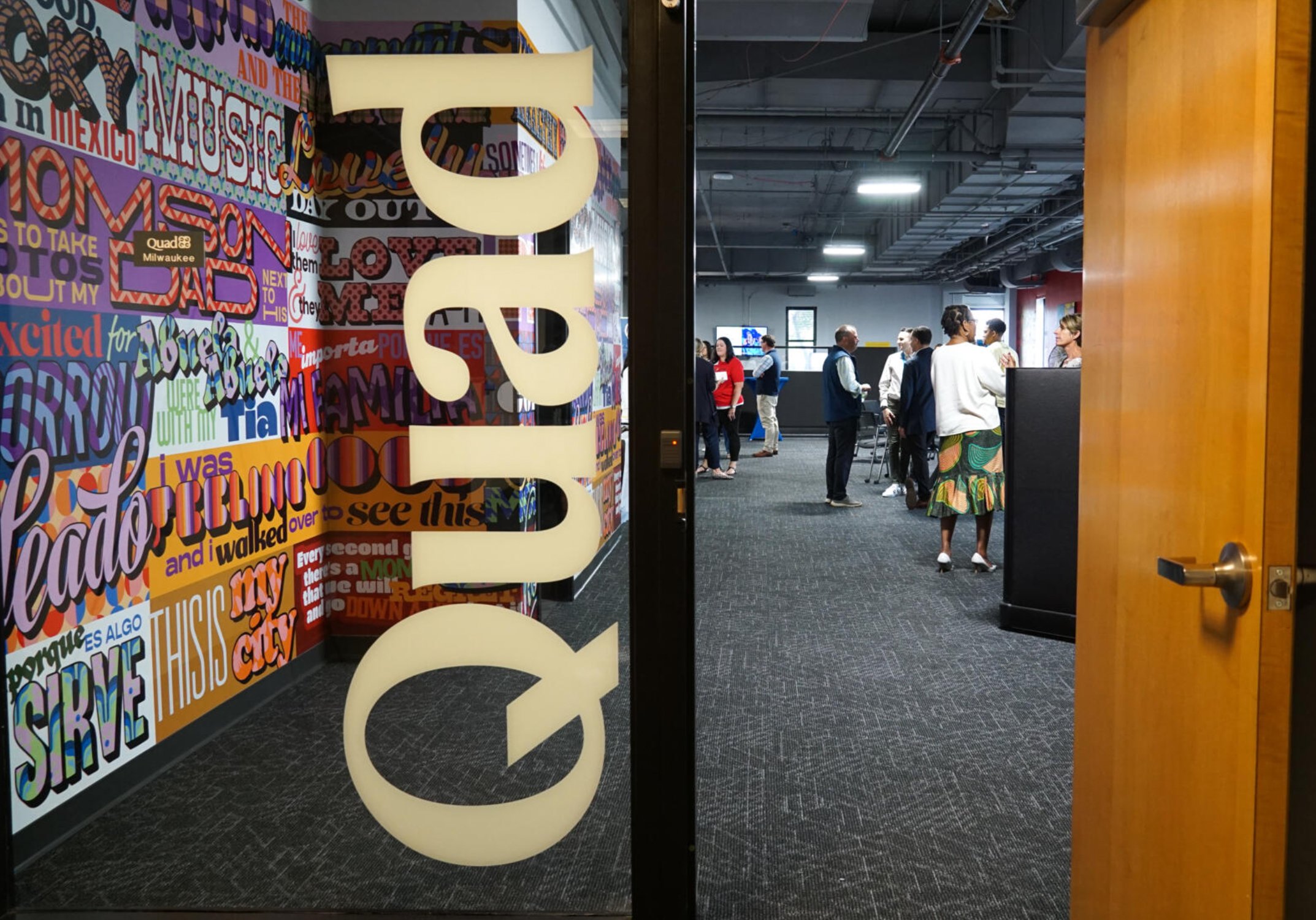
Quad’s new design system bridges the past with the future using the Quad logo, affectionately known as the “Quad Bug.” The Quad Bug is a heritage mark of stacked Q and G letterforms, created in 1971 for founder Harry Quadracci by designer David Hackett at Unicom Milwaukee. It served as a shorthand for the company name and also as a visual nod to the printing press with its cyan, yellow, magenta and black color rollers.
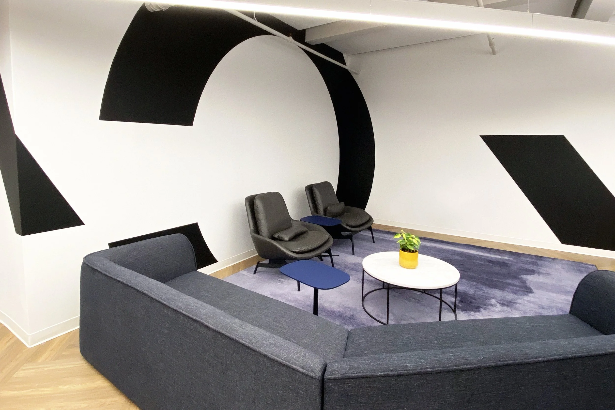
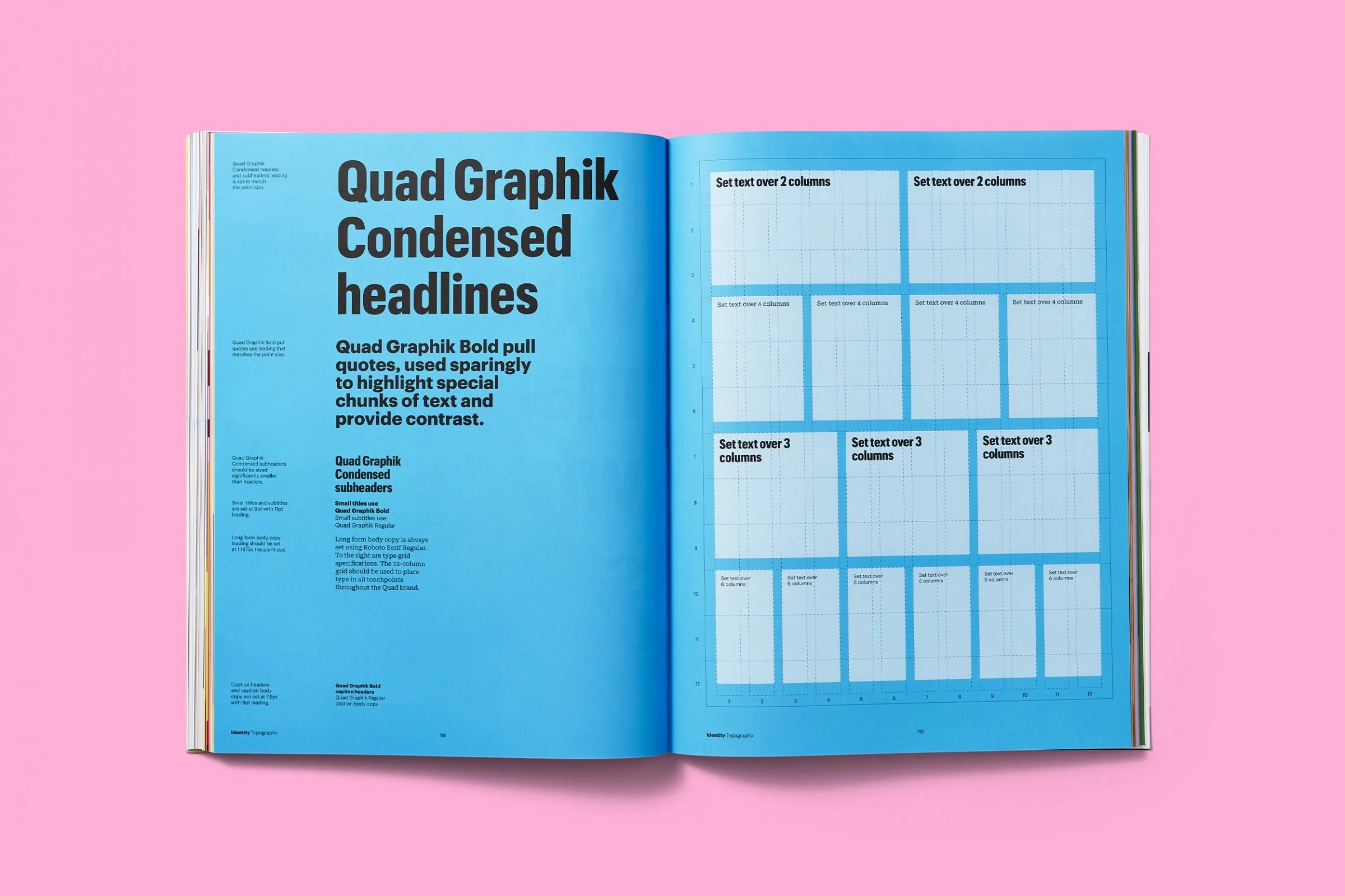
Quad’s new design system explodes the Bug logo into its core parts to create three core design system components: “Fractiles,” Kaleidoscopes and Type. These elements rely on a Modernist visual language to help the identity represent the company’s brand narrative using the flat, graphic aesthetics that reinforce the vibrance of ideas and creativity that are common to the marketing industry—and were leading culture at the time the original logo was designed in the 1970s.
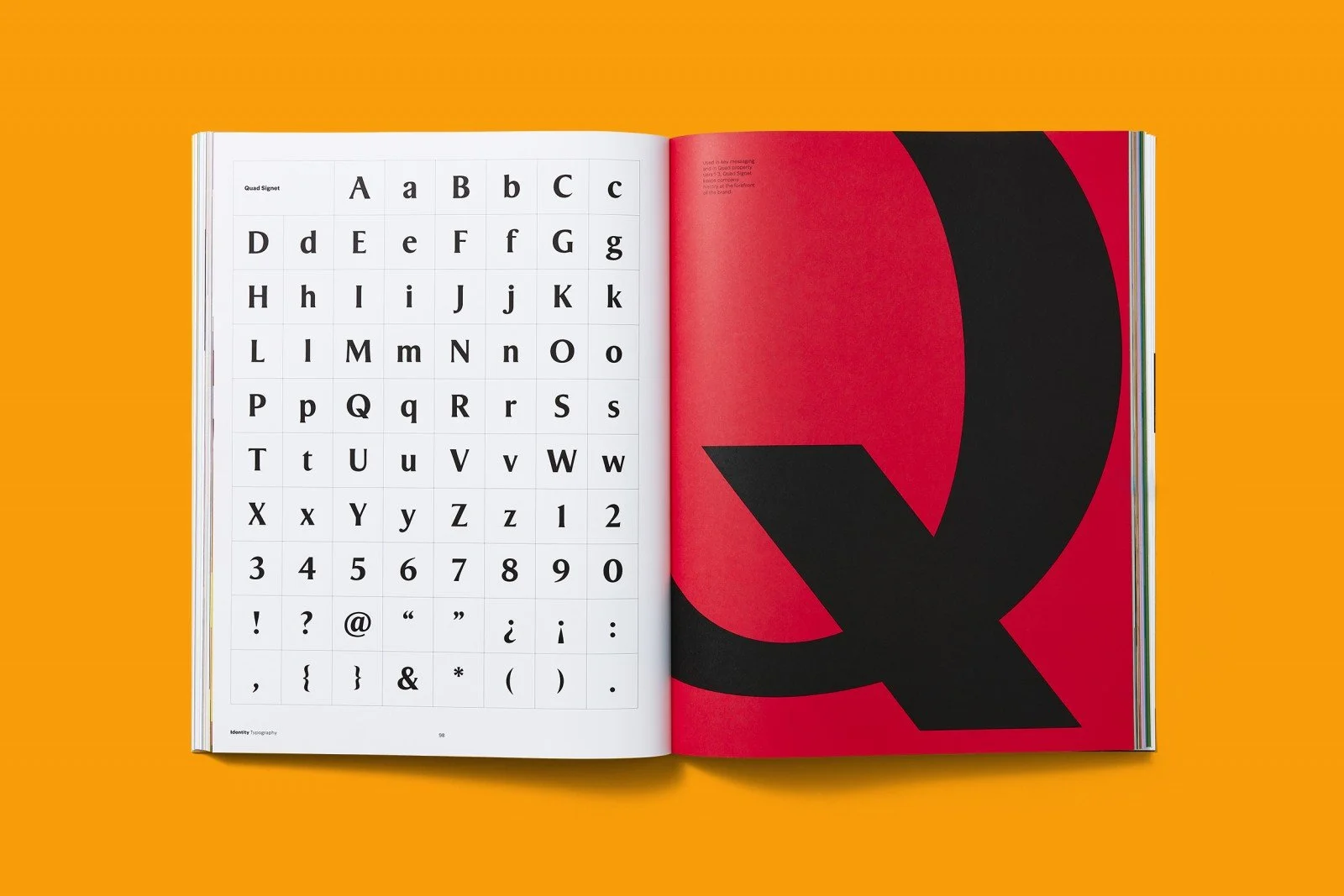
The custom type system has been recognized with multiple industry honors. Made up of an original, proprietary display face called Quad Signet (drawn from scratch for the brand in 2022, and also based on a cutting-edge design from the midcentury that prevailed in the ’70s) and a customized “Quad Graphik” version of Commercial Type’s Graphik, the system relies on a very bold typographic applications paired with a simple modular grid that can be flexibly applied to any shape or frame consistently.


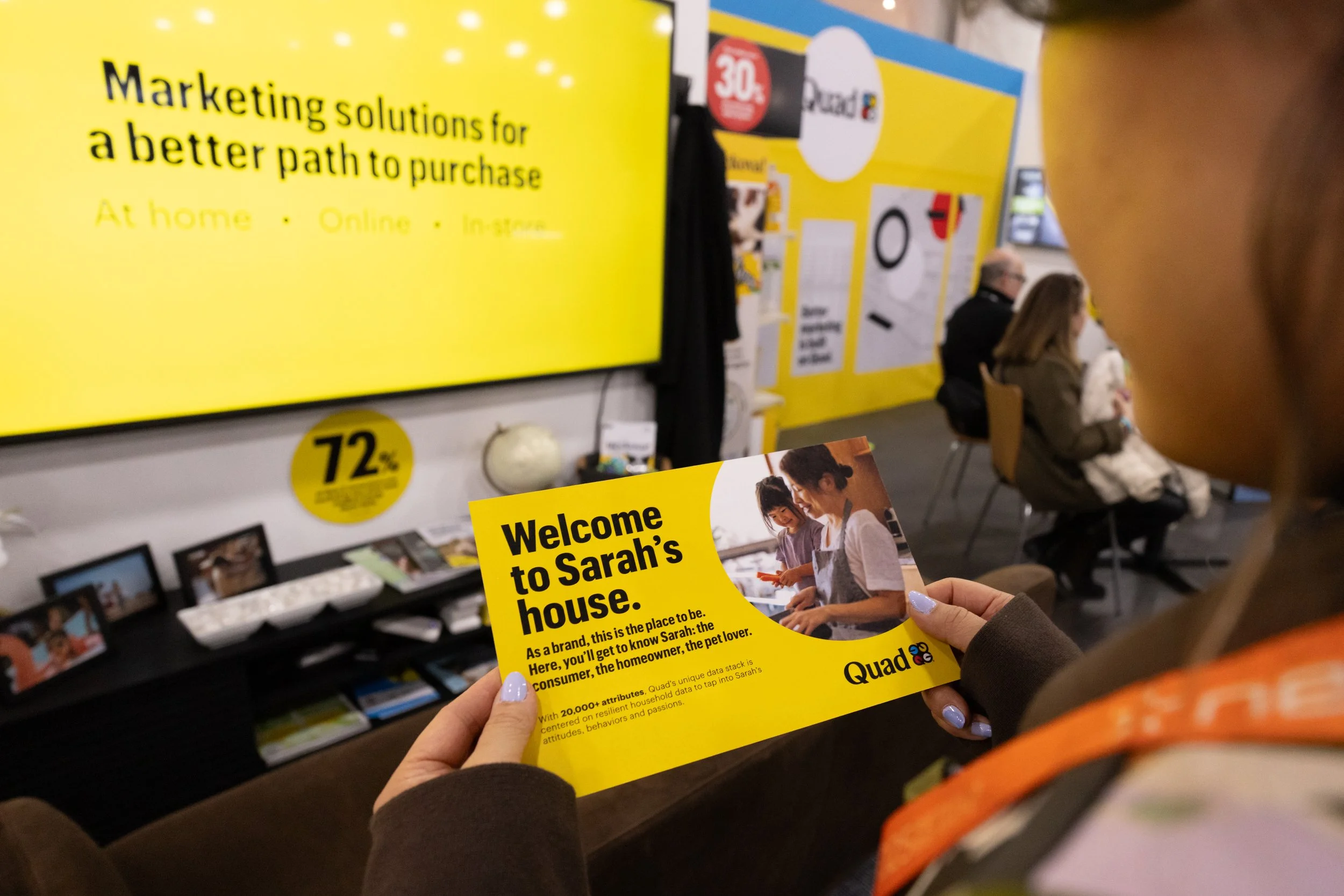
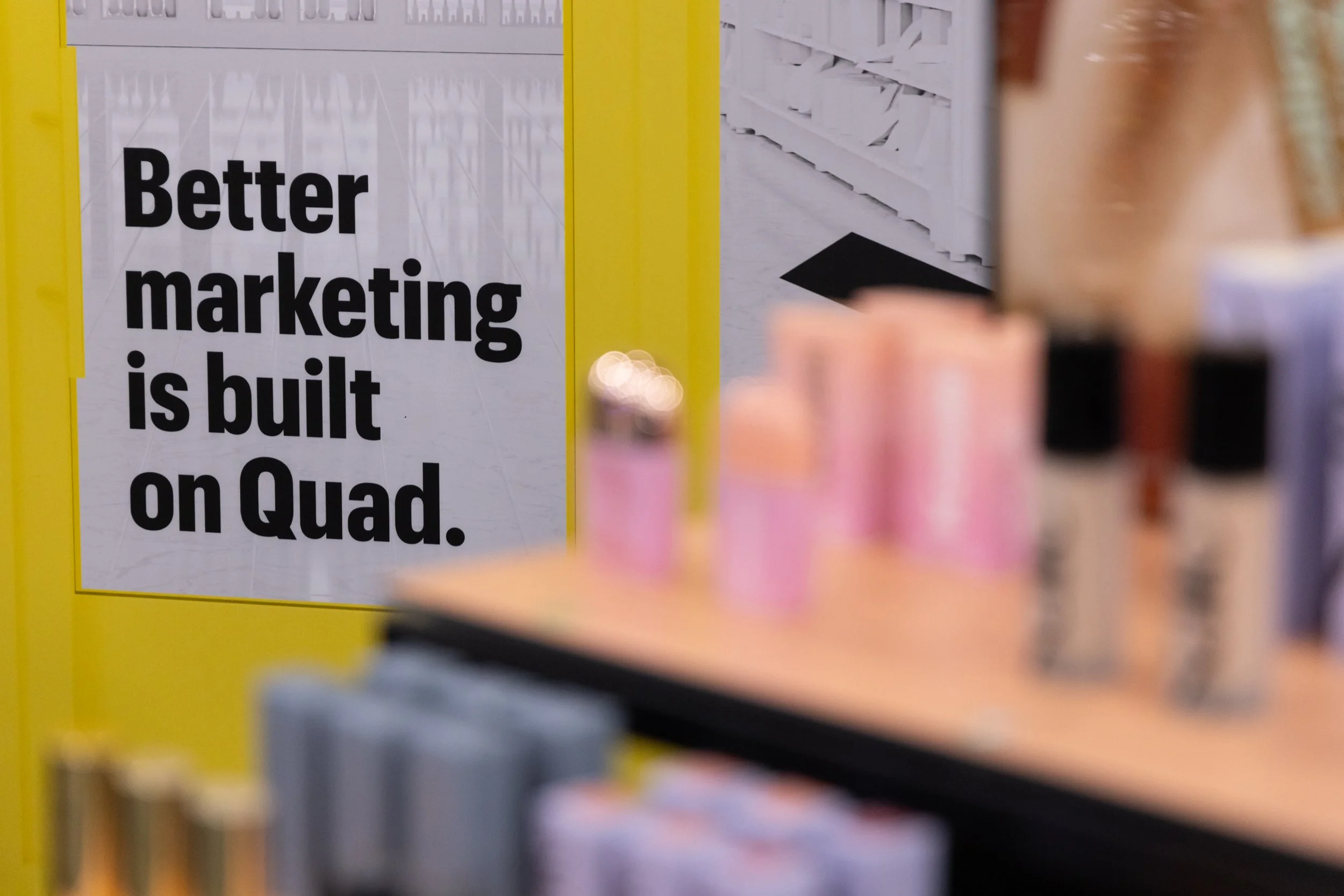
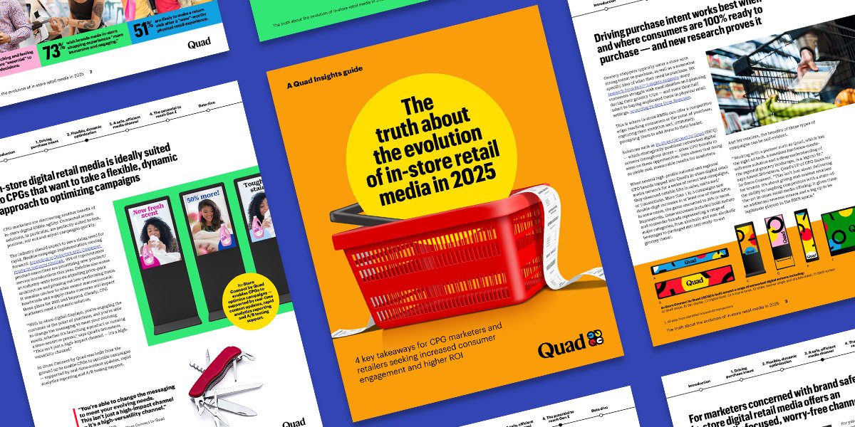
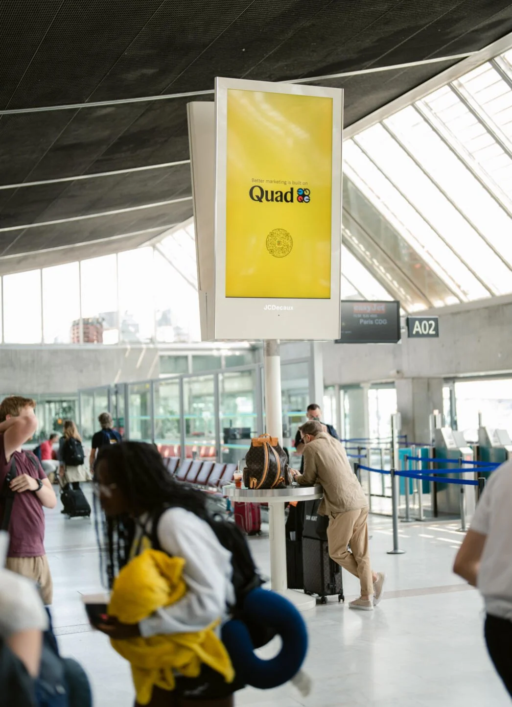


Better Marketing is Built on Quad
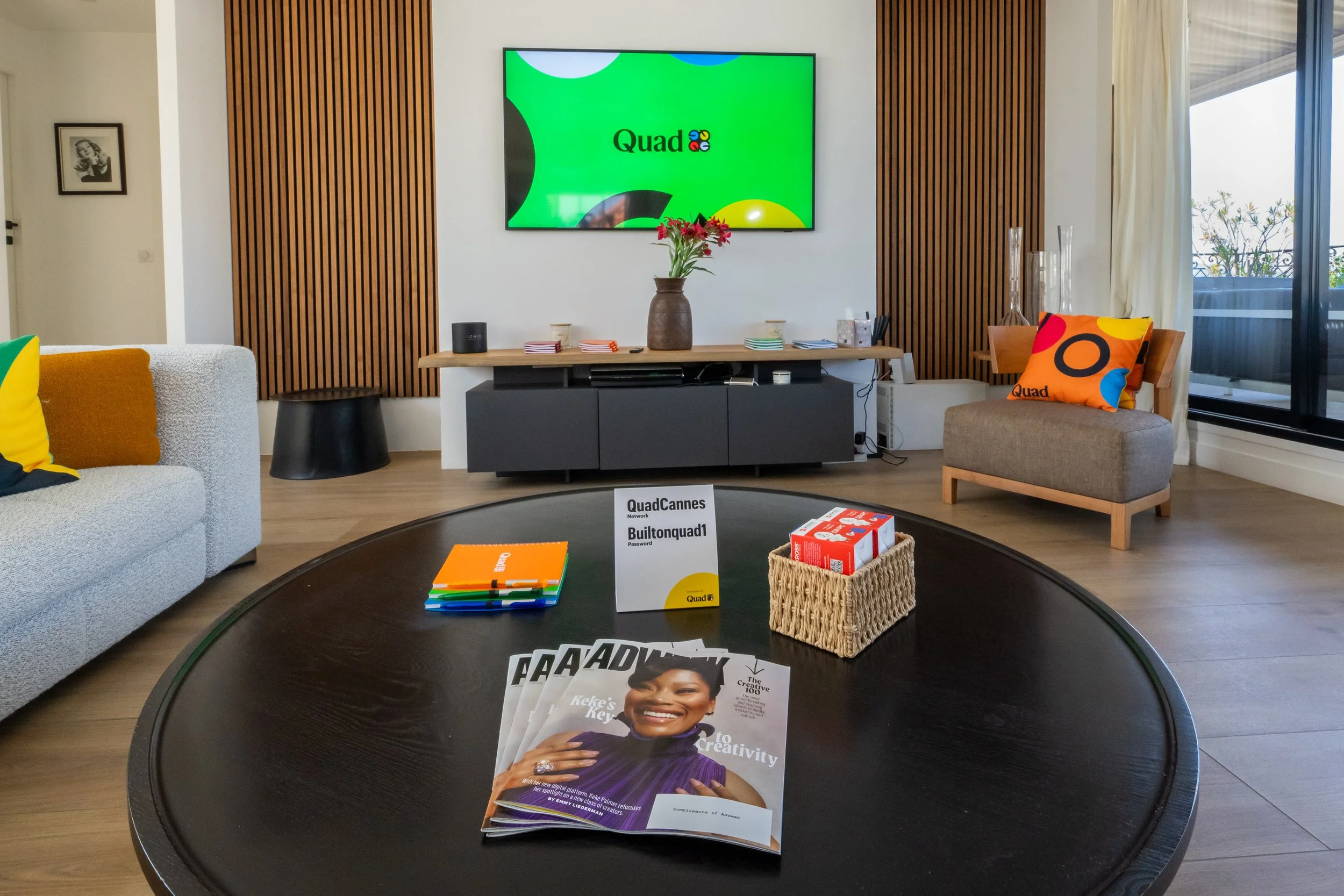
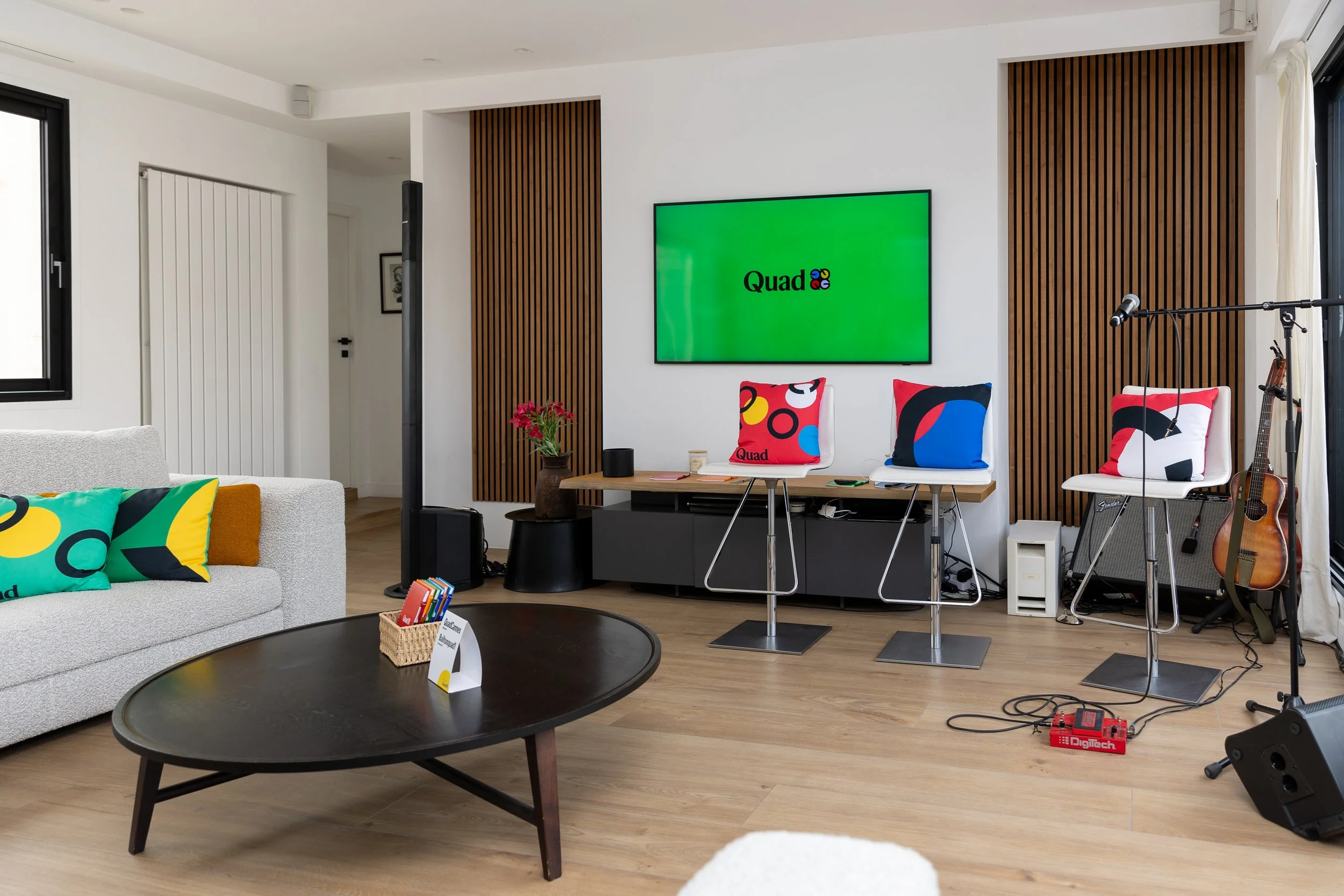
Following the implementation of the brand, a campaign was launched to drive brand awareness and reintroduce Quad’s integrated MX offering to the marketing community. Kicking off for the 2023 Cannes Lions International Festival of Creativity, the campaign included out-of-home takeovers at the Nice Côte d’Azur international airport (where nearly all Cannes attendees arrive), targeted digital pre-rolls, print, an activation suite along Boulevard de la Croisette during the festival, and other live events.
The first brand spot, an anthem entitled “Marketing Machine,” captured the depth of the chaos and complexity marketers face daily in their work while offering a clear solution to keep their marketing machines running smoothly. The visual style brought Quad’s graphic design system front and center, and used a mechanical reference to harken back to Quad’s core production prowess built on a half century of experience in printing, distribution and logistics.
Other brand spots included an appeal to marketers by telling them if they didn’t have time to click the message, then they probably should, as well a look at the ever-expanding universe of marketing job titles as a way to talk about all the ways Quad can help. In 2025, we introduced a new chapter in the brand campaign’s legacy by creating a new spot, “The Performance Pickle,” exploring how hard it is to balance the needs of immediate demand-driven marketing ROAS against the need for longterm ROI on your brand.
Growing the brand ecosystem
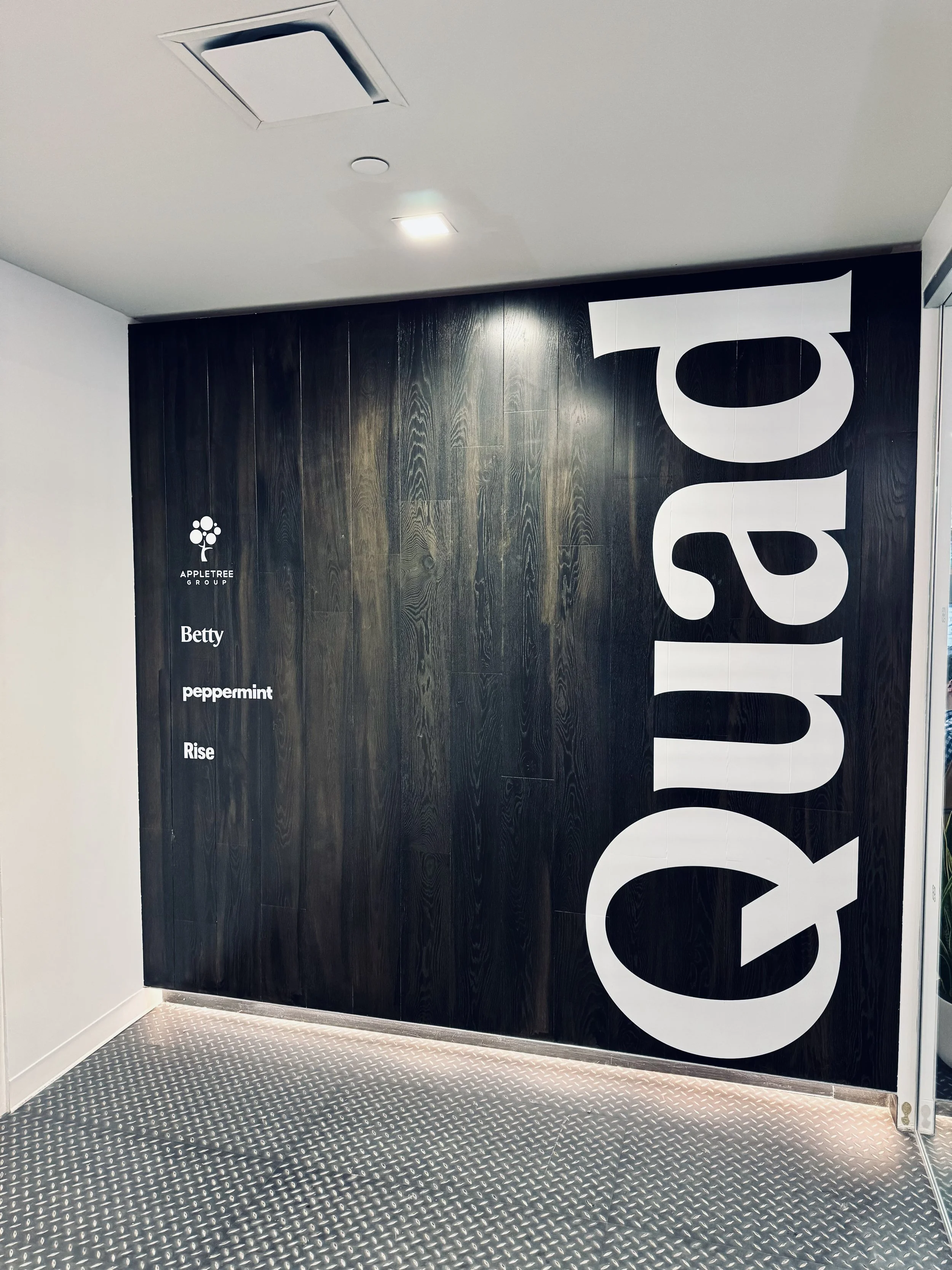
After achieving a full implementation, Quad’s marketing team began to approach divisional holdings and subsidiaries to bring more tightly-connected branding forward for them. The business also pursued a strategy of deeper integration, combining all of Quad’s creative and content production units together. This integrated creative offering is now available through agency Betty, named for co-founder Betty Quadracci (and wife of Harry Quadracci and mother to current CEO Joel Quadracci). All of Quad’s media and performance marketing offerings were consolidated under the umbrella of agency Rise, with ethical media-buying and household linked customer profile data at its core. And Quad’s occupational health service, QuadMed, also adopted the core components of the brand system, working with Champions and Commercial Type to modify their word mark and their special “pulse bug” logo to align with and build upon the updated identity system established for the parent company.
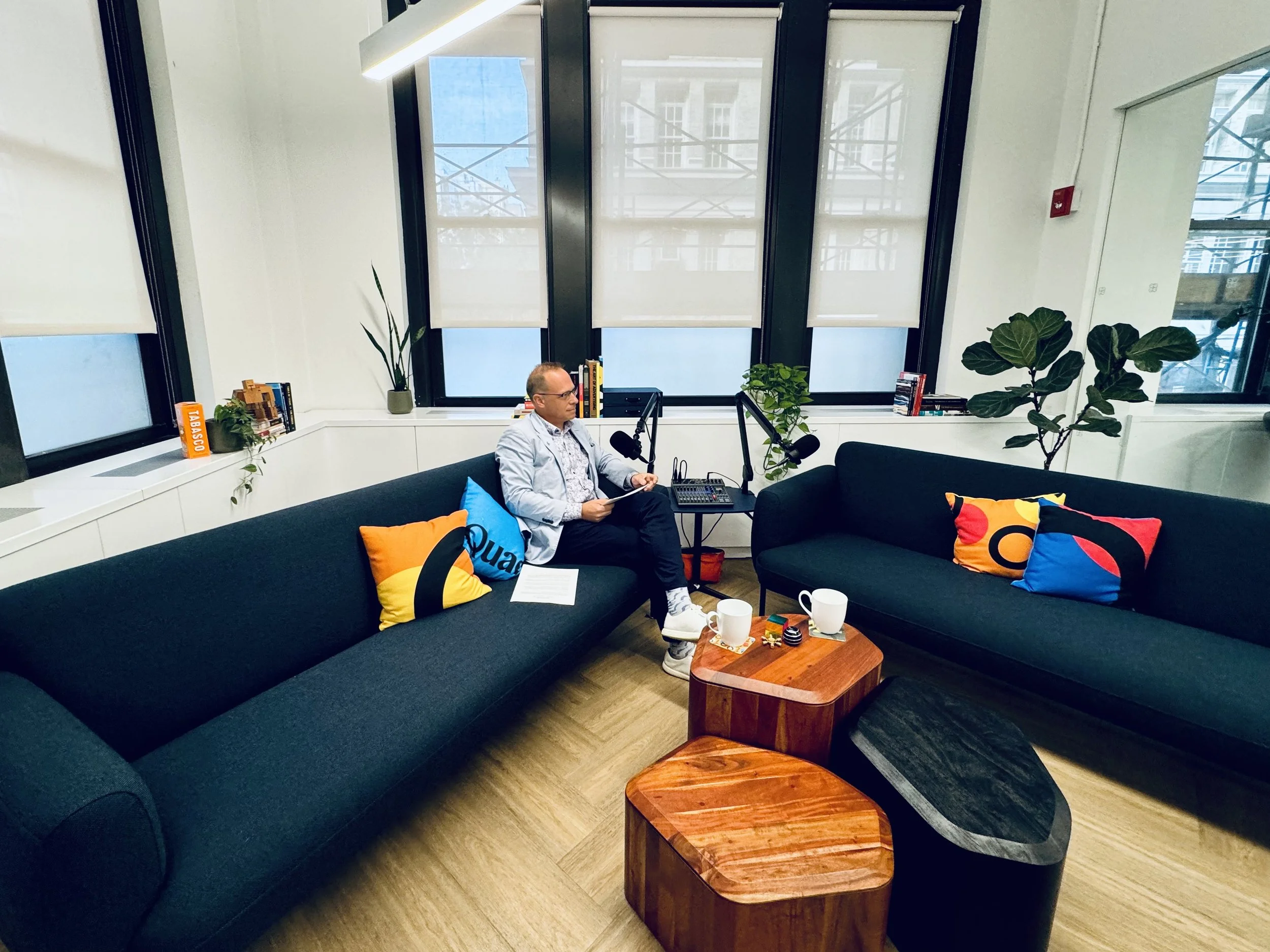
In addition to the rollout down and through the organization’s entities, we also fielded requests to create branded environments for our offices, including way-finding updates as well as more expressive interior design consulting. Our New York City office, which I had the pleasure of designing with our brilliant architects at Spacesmith, became the inspiration for several lobby refreshes in plants, office rethinks and new location installs. Considering the brand when designing space was a phenomenally expressive and rewarding part of the project, which allowed us to consider everything about the built human environment to enhance our narrative as well as our teams’ productivity, ideation and general wellbeing at work—the place we spend the most waking hours of our lives.